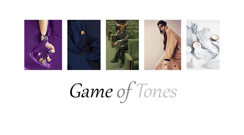
Game of Tones – by Kim Fisher


Fanny Latour Lambert
French. French. Very French.
www.fannylatourlambert.com/

Kelsey Mcclellan
Photographer | San Francisco
www.kelseymcclellan.com

Marcus Ohlsson
Studio Marcus Ohlsson Inc.
www.dandvmanagement.com

Stephanie Gonot
Los Angeles-based photographer and director.
www.stephaniegonot.com

Studio Kanji Ishii
Innovative Worldwide Photography.
www.kanjiishii.com

Marta Syrko (Guest Feature)
Marta Syrko has been working as a professional photographer for 5 years. She has her own studio in Ukraine, but also travels a lot, because of photoshoots abroad.

THE SHOT with Chris Nicholls
THE SHOT takes the viewer on a behind-the-scenes adventure into the Mojave Desert to shoot a cover and editorial for Dress to Kill magazine.
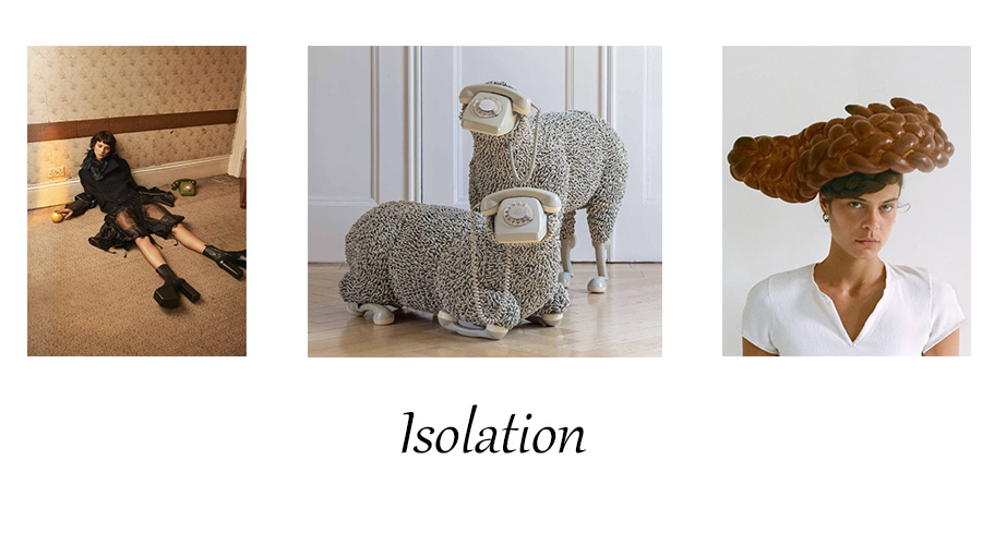
Isolation 2020
“The urge to make things and create things hasn’t gone away. I still have stories to tell.” – Marc Jacobs
1 comment on “Game of Tones – by Kim Fisher”